
Little big updates
Design manager
Designer
Researcher
One
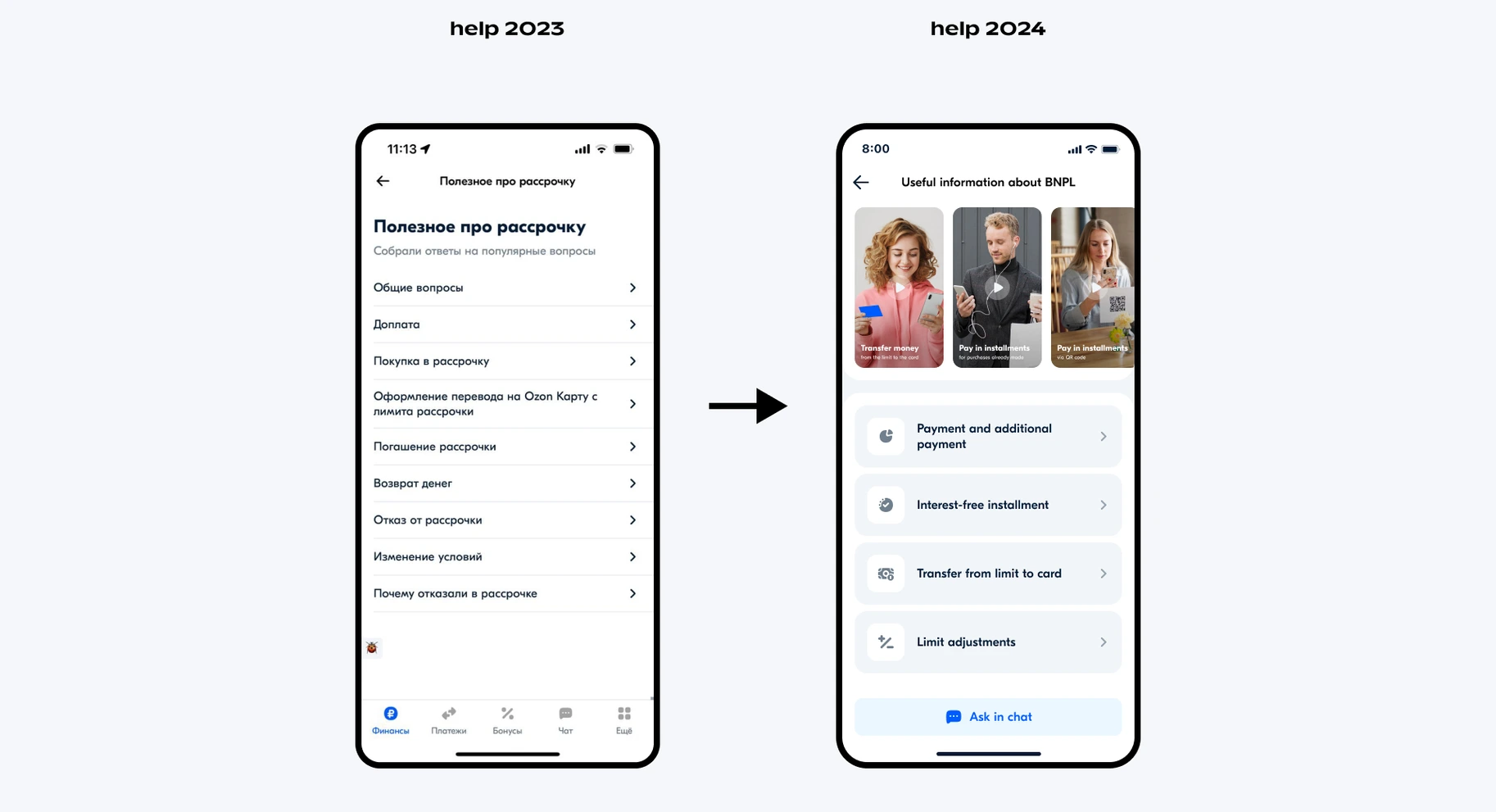
We turned the most frequent support questions into short videos and addressed other questions in the form of brief articles in plain language
Two
We found the right balance of size and clarity — enough to not occupy half the screen and to clearly present everything to the user
Three
We turned the most frequent support questions into short videos and addressed other questions in the form of brief articles in plain language
We found the right balance of size and clarity — enough to not occupy half the screen and to clearly present everything to the user
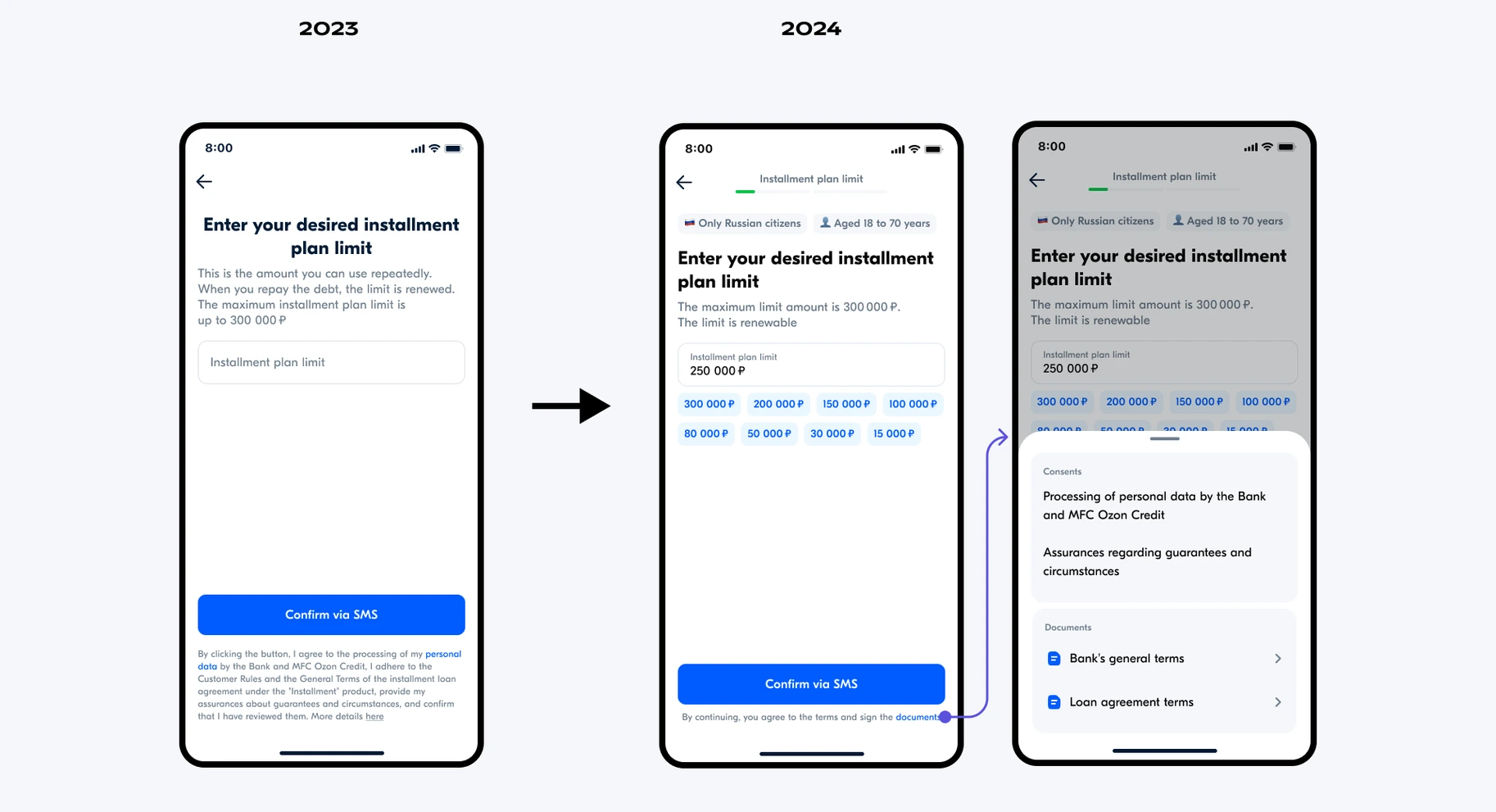
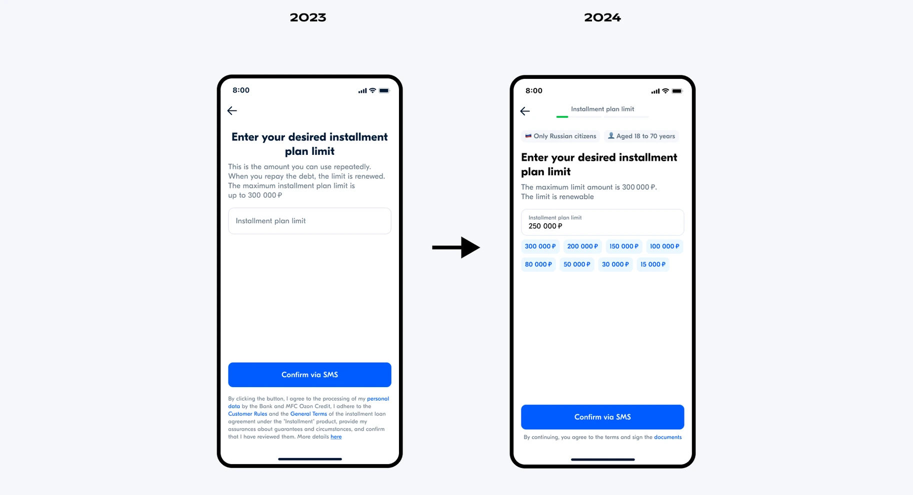
Entering the desired credit limit is now 4.7 times faster with suggested amounts. Previously, underage users or foreigners would start filling out the form, only to discover halfway through that they couldn't apply for BNPL. Now, this information appears on the first screen, saving time and steps.
The loader at the top of the screen also shows progress, helping users track their completion time.
Four
We won the battle with the lawyers!
Hid the long texts ("Sub-button area") under a collapsible button, which led to a reduction in the time it takes to complete the form since the buttons to proceed to the next step were previously at different levels due to the varying heights of the sub-button text